Brand Guidelines
At BLOK Capital, our color palette is carefully curated to reflect both our technological innovation and our community-first approach. Each color has been chosen with intentional symbolism, supporting our brand narrative and enhancing visual coherence across all platforms.
Our visual identity bridges the world of blockchain with the elegance of being easier, safer, and smarter. The use of colors in our illustrations, UI elements, and overall website design aims to express this balance, creating an environment that feels secure, vibrant, and forward-thinking.
The Palette
Our color palette is built to resonate with our core values and design philosophy. Each color plays a strategic role across our interface, illustrations, and brand communication.
| Color | Hex | Preview | Meaning & Usage |
|---|---|---|---|
| Sky Blue | #7DD2FD | Rooted in our brand logo, this refreshing blue represents clarity, vision, and trust. It anchors our visual identity and is prominently used in UI highlights,, and focal illustration elements. | |
| Lime Green | #7ED116 | Inspired by our internal metaphor of BLOK as a garden, this vibrant green represents organic growth, sustainability, and progressive thinking. Commonly used in illustrations to convey action and momentum. | |
| Neutral Linen | #F6F3E8 | A gentle neutral that adds calm and balance. Ideal for backgrounds, layouts, or secondary shapes, it provides depth without competing for attention. | |
| Coral Red | #EC464D | Bold and expressive, this color is used sparingly to draw attention. Whether highlighting a button or emphasizing narrative moments, it introduces emotion, urgency, and warmth. | |
| Earth Brown | #844947 | A grounding tone symbolizing stability, trust, and maturity. It is typically used in outlines, shadows, or visual support elements to reinforce contrast and structural consistency. |
Why This Palette Works
This palette is modern, modular, and meaningful. Each color aligns with a part of our identity:
- Sky Blue: Our foundation, inspired by the brand mark.
- Lime Green: Our metaphor for cultivating growth—financially and intellectually.
- The Rest: Designed to support, balance, and enhance the overall visual experience.
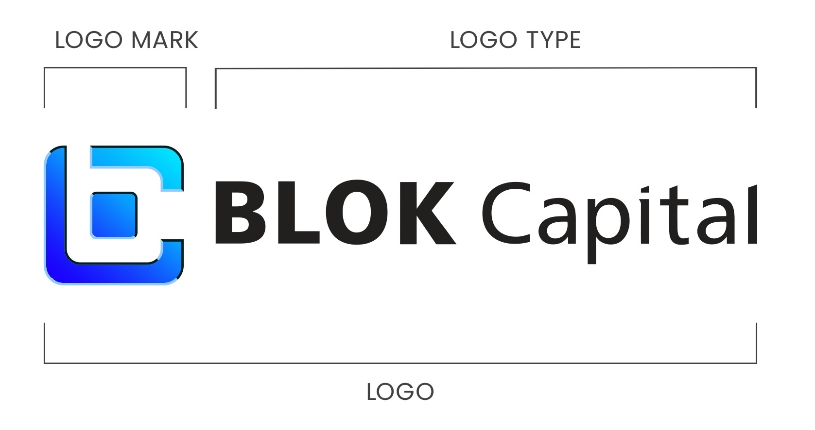
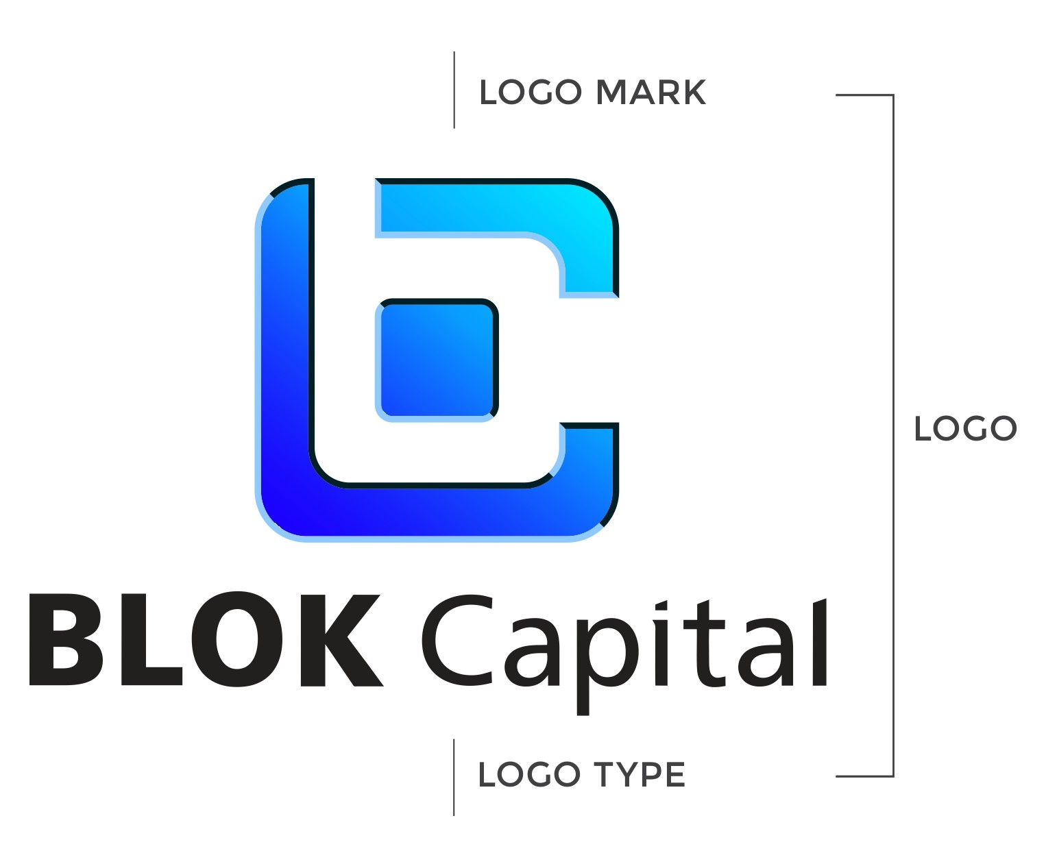
Logo Design
The BLOK Capital logo is a foundational element of our visual identity. It features a custom-designed symbol paired with a distinctive logotype, crafted for flexibility across diverse applications and environments. This section outlines the official logo formats, usage guidelines, and visual standards to ensure consistent and impactful representation of the BLOK Capital brand.
For full brand guidelines please see BLOK Capital Brand Guidelines.
Primary Logo
The primary logo should be used whenever possible to maintain brand consistency. It includes the logo mark and the logotype in a balanced composition.
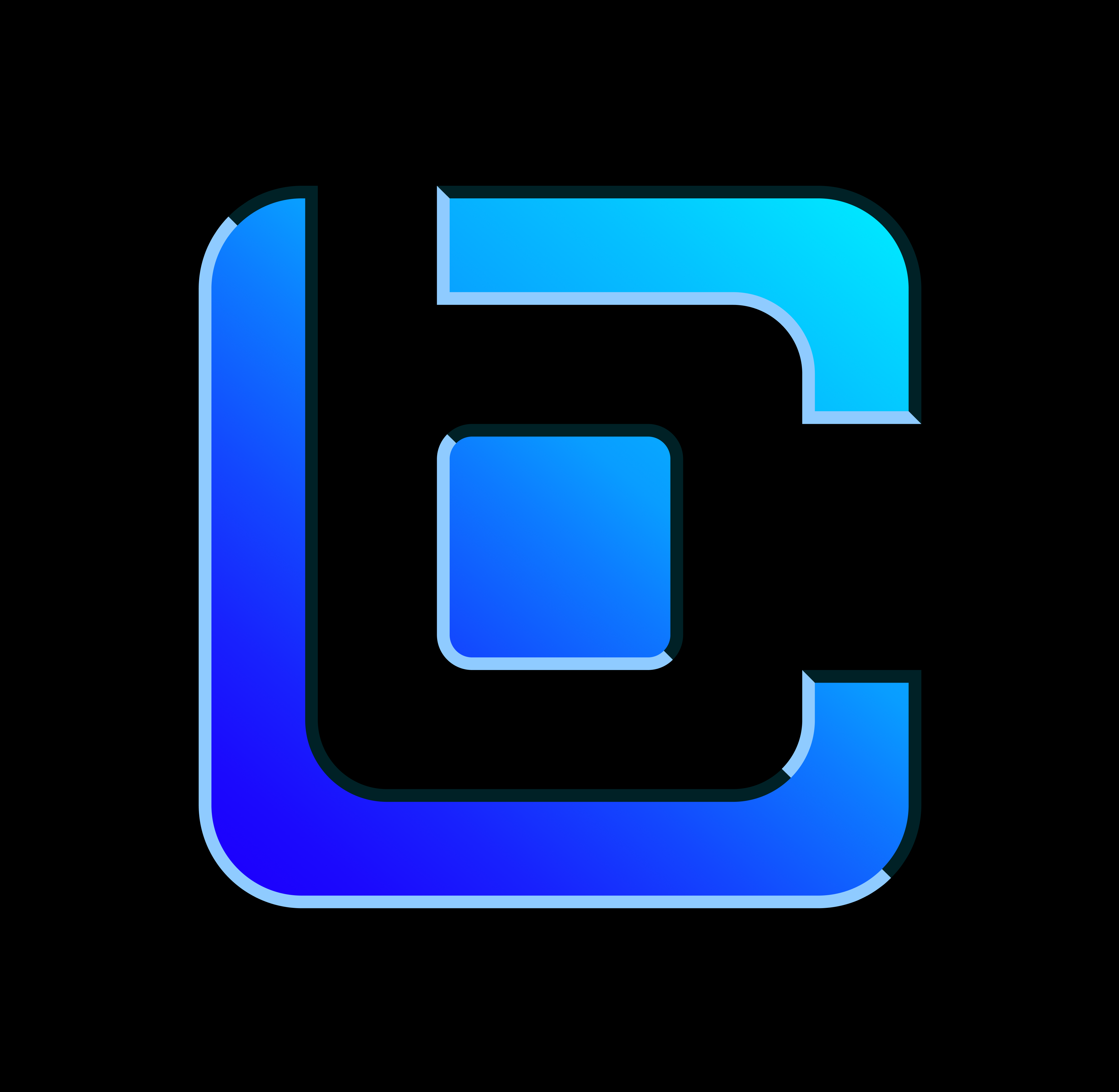
Mono Color Logo
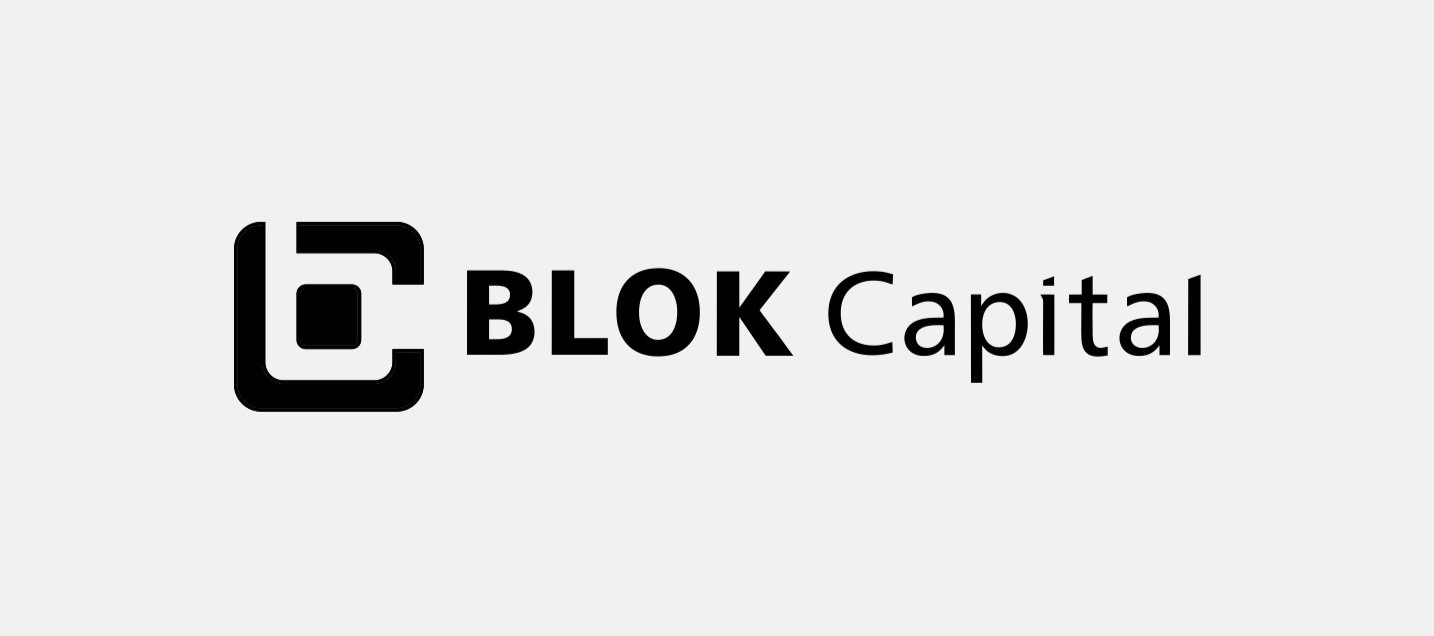
In cases where full color printing is not feasible (e.g., due to production cost constraints), a mono color version of the logo should be used. The logo should either be in a dark color on a light background or in a light color on a dark background. Avoid any loss of contrast.
White Logo on Black Background
Black Logo on White Background
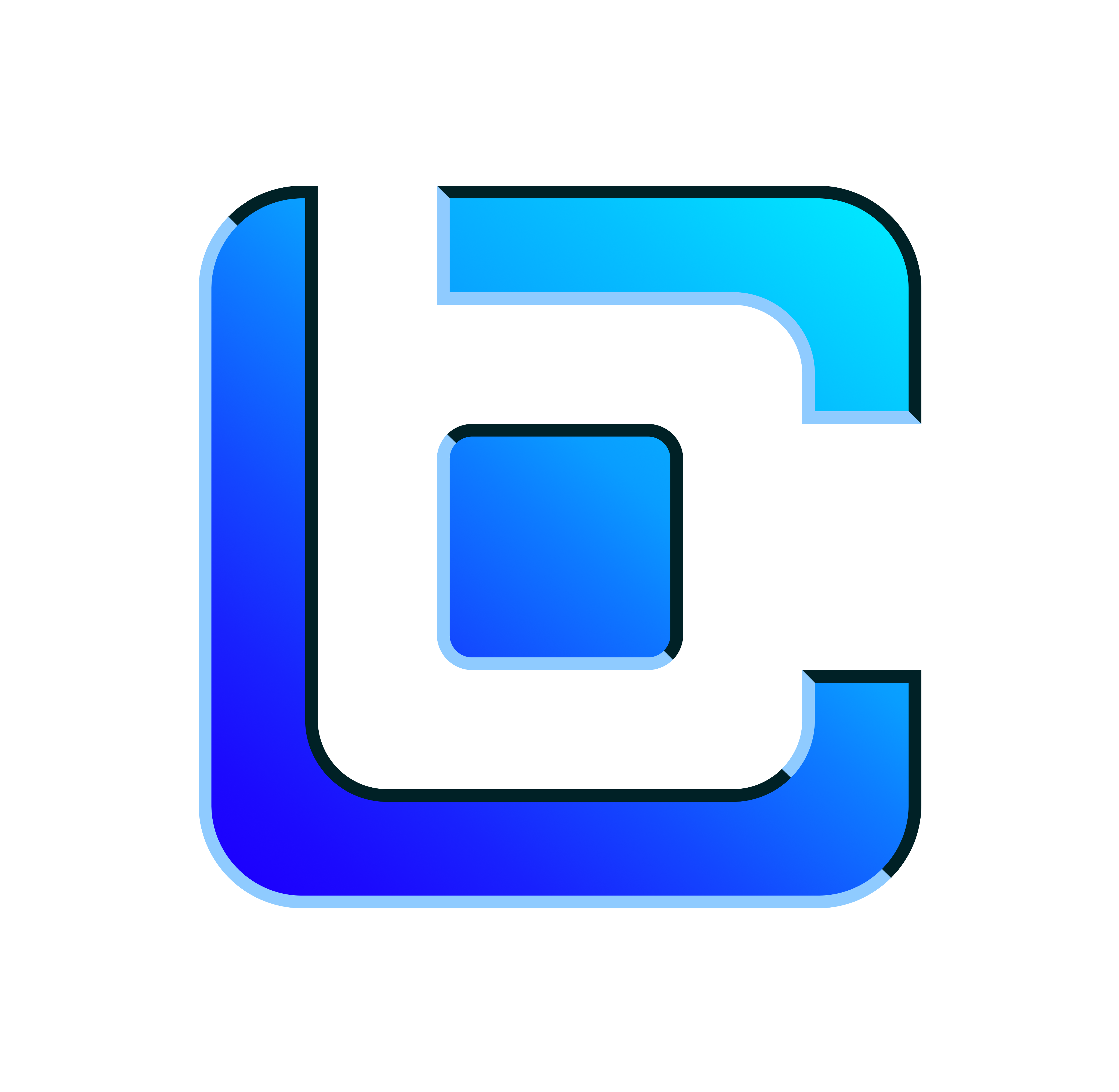
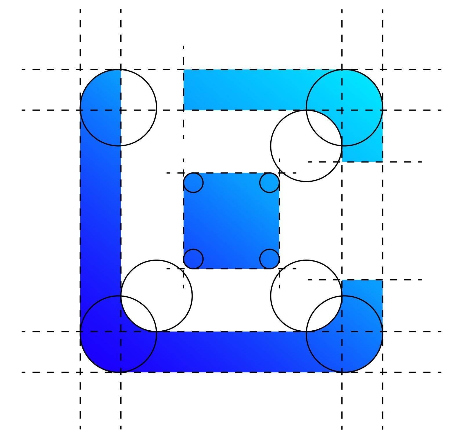
Mark Construction
The BLOK mark is built using a precise grid and geometric shapes. This ensures balance, clarity, and consistency across all uses.
Horizontal Logo
This version is used when the layout demands a wide and short form factor. Ideal for horizontal spaces like website headers or letterheads.
Vertical Logo
When a square or compact format is required (e.g., cover pages, profile icons), the vertical version should be used. It stacks the logo mark and logotype vertically.
Logo on Various Backgrounds
Here are approved color combinations for placing the logo on different backgrounds. Ensure proper contrast and avoid overly complex backdrops.
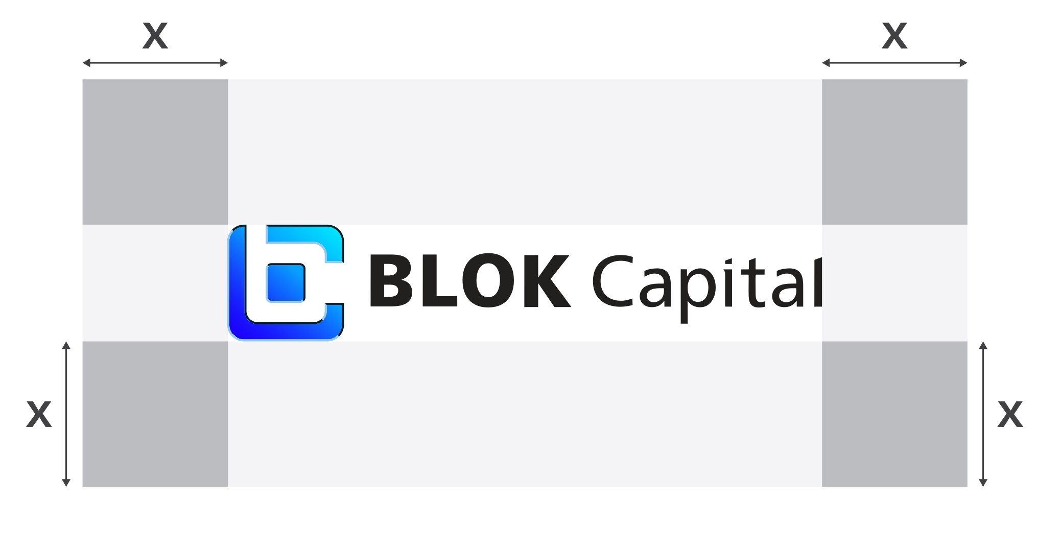
Logo Safe Zone
To maintain clarity and impact, preserve adequate whitespace around the logo. No other design elements or text should enter this area.
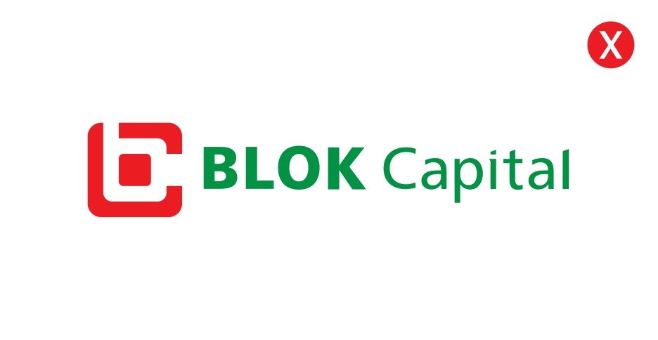
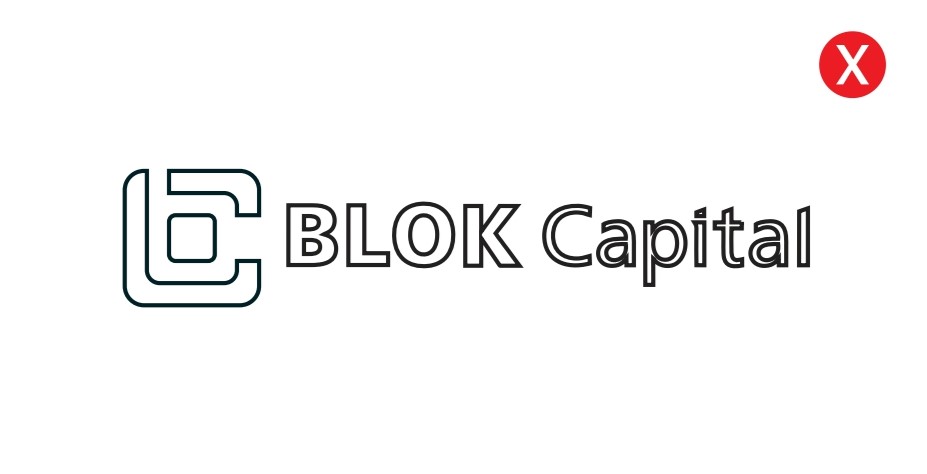
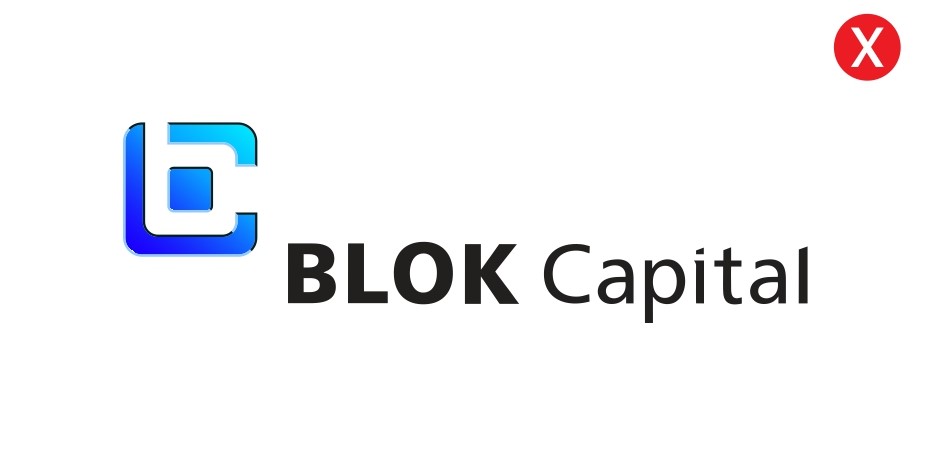
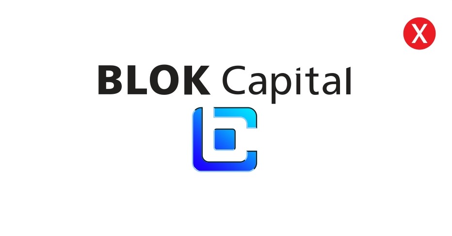
Improper Logo Usage
To protect brand integrity, never alter the logo. Here are examples of incorrect uses that should be avoided:
Don’t use logo as a frame for imagery
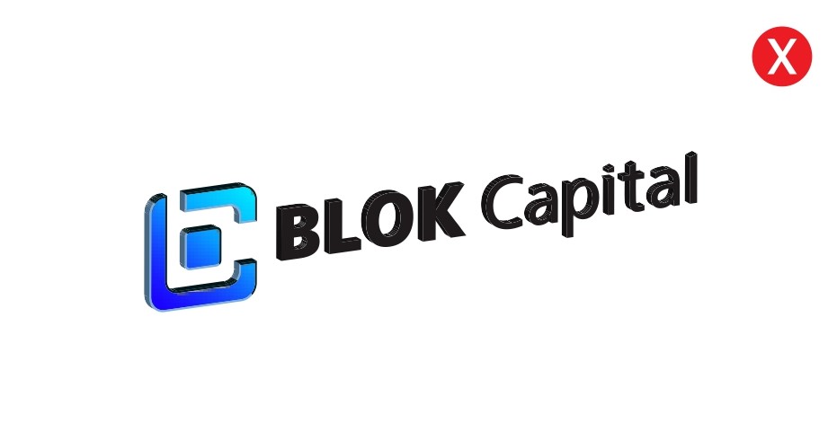
Don’t use drop shadows
Don’t use busy backgrounds
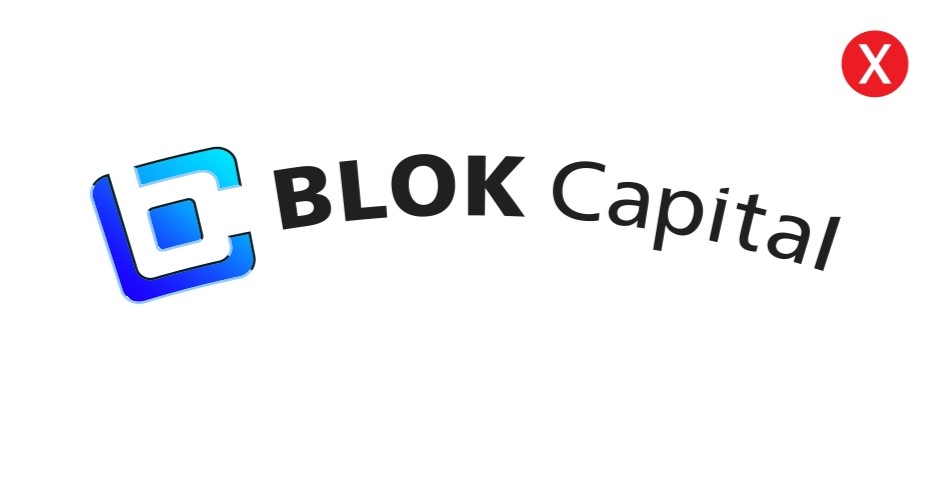
Don’t rotate the logo
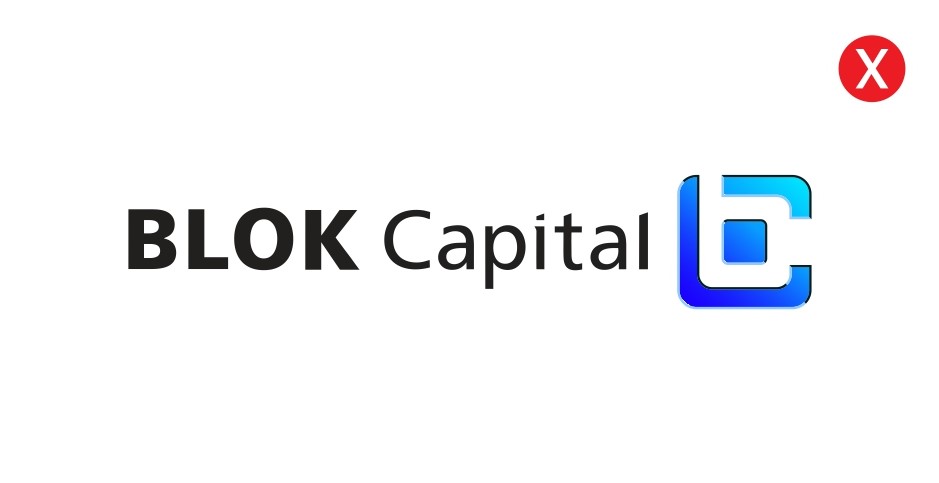
Don’t use logo as a frame for imagery
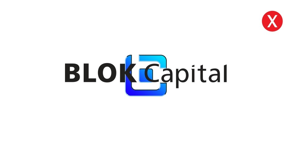
Don’t use logo as a frame for imagery
Don’t use logo as a frame for imagery
Don’t use logo as a frame for imagery